A few posts ago, we have shown how to create a dashboard in Grafana.
(GrafanaでXCALLYのダッシュボードを作ってみた)
And today we will demonstrate how to create simple table and graph calculating the “Break Time” of an XCALLY agent by using SQL.
For anyone who is interested to know more about Grafana, please check out Grafana’s homepage.
目次
Create table
Choose Visualizlation
First of all, we will start by selecting “Choose Visualization”. It is also fine to start from “Add Query” since the visualization can be changed anytime. It really depends on personal preference.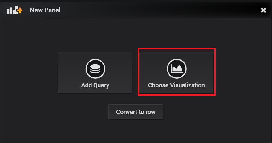
Edit SQL
Now we are in text edit mode and can start editing the SQL, or switch to query builder as you like. Make sure “Format as” is set to Table instead of “Time series” so it doesn’t show any error.
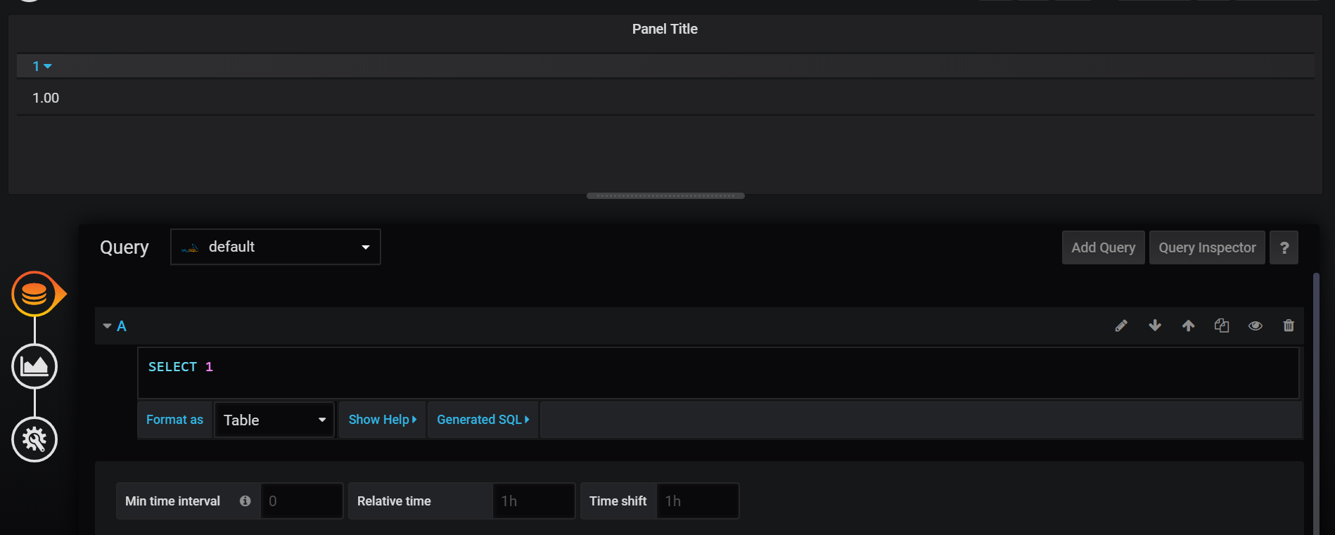
Here is an example of SQL for the table:
|
1 2 3 4 5 6 7 8 9 10 |
SELECT DATE(updatedAt) AS Time, membername AS "Agent", SEC_TO_TIME(SUM(CASE WHEN type='LOGIN' THEN duration END)) AS "Log In Time", SEC_TO_TIME(SUM(CASE WHEN type='PAUSE' THEN duration END)) AS "Total Break Time", CONCAT(ROUND(SUM(CASE WHEN type='PAUSE' THEN duration END)/SUM(CASE WHEN type='LOGIN' THEN duration END)*100,2), '%') AS "Percentage" FROM report_member WHERE $__timeFilter(updatedAt) AND (channel="voice") GROUP BY DATE(updatedAt), membername |
Note
Please remember in order to have the table display data corresponding to the time range selected, timeFilter needs to be added in the SQL, such as $__timeFilter(updatedAt); otherwise, the time filter on Grafana will not work.
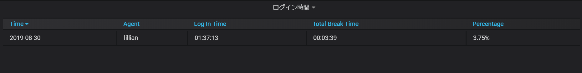
Now make a few adjusts so our table will look better. If you have a time column, make sure the column header is the same as the column alias.

Voila! Now we have created a simple Grafana table.
Create Graph
Design your SQL
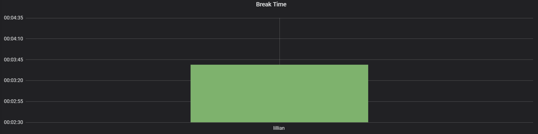
Next, we will create a graph to show Break Time of XCALLY agent. Here is the SQL example.
|
1 2 3 4 5 6 7 |
SELECT DATE(updatedAt) AS time, membername AS metric, SUM(CASE WHEN type='PAUSE' THEN duration END) AS value FROM report_member WHERE ($__timeFilter(updatedAt) AND (channel="voice")) GROUP BY DATE(updatedAt), membername |
And the result looks like this:
Note
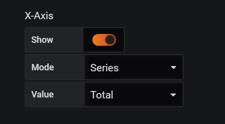
When creating table or graph, please keep a few things in mind:
- Add time filter in query for the time range to work properly.
- The mode of x-axis can affect the outcome of the graph, so make sure to pick the right one. As following:
- がんばれパンチくん!パンチくんに会いに行ってきた! - 2026-03-21
- Asteriskワーニング:Autodestruct on dialog - 2022-03-02
- Kamailioを設定しましょう - 2021-07-02
- AWSでKamailioを構築 - 2021-06-13
- XCALLYでVoice botを作ってみました【Dialogflow×AWS Polly×GoogleASR】 - 2020-12-01
【採用情報】一緒に働く仲間を募集しています